Galleries

High standard of works are on show in first Coventry University MA Painting exhibition

The inaugural exhibition of the MA Painting course at Coventry University has ended on a high with an exhibition of works by the first graduating students – and they have set the bar high for those that follow.

The top floor of the Graham Sutherland building on the corner of Cox Street in the city centre is the venue for the show, open Saturday, September 10 and Monday-Wednesday 12-14, and it is worth detouring to see (if you can get in the building). There are works by just three full-time and two part-time students.

The works that drew me in most were by Zhen Zhai, who also calls herself Dakota Zuch, and who comes from the south of China. She has created a number of paintings of life in China for two very different groups of people. Some of the works are ‘normal’ painting-size, but there are also dozens of small postcard-sized ones with an extraordinary amount of detail.

The whole collection is called They Don’t Want to Live With Grandparents. Some paintings feature the glamour and wealth of the big city, where a bright highway cuts through dark sky scrapers, and contrasts with village scenes of poor homes and pylons, trucks in quarries, and people gathering berries or selling fruit by the roadside. Zhen Zai told me they were about the children left behind with grandparents when parents went off to the cities for work. They stayed poor, whereas the children that grew up in the cities were rich – shown in these images of university graduation, glamorous hotels and schools. She had been to the rural north to meet the children left behind, some of whom didn’t even know what the glasses on her face were. The poignant story has created some confident, skilled paintings; Zhen is returning to China to complete another MA there.

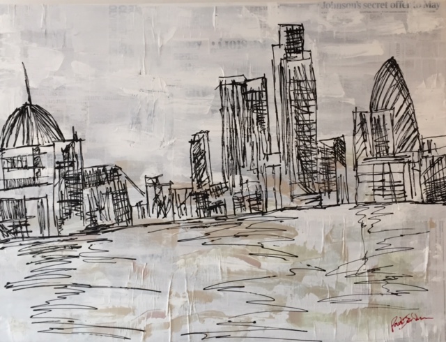
Matthew Morrison Macaulay’s work is familiar from previous exhibitions in the city, but studying for the MA has led him to rethink and look anew at paintings, and he said this collection is “paintings about paintings”. In particular he had become interested in Manet’s Portrait of Mademoiselle Claus from the Ashmolean in Oxford. Some of his works feature lines bisecting them, and this comes from the balcony and shutters in the picture, and there’s also more blurring of colours and seemingly smudging over “in a Richter-esque way”. It’s interesting to see where his works will go in his future studies.

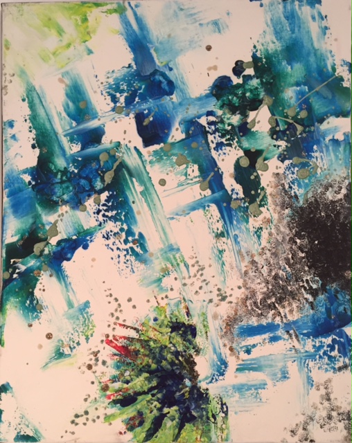
Susa Lee works with textiles and paintings; some, which she said come from her imagination, showed cats in colourful, abstract scenes, plus one which brought back nightclub memories. The textile works involve cutting, painting and arranging in flag-like ways. She said the MA had been all she hoped it would be, and said she has realised she has to see other people’s artworks ‘live’ to be inspired by them.

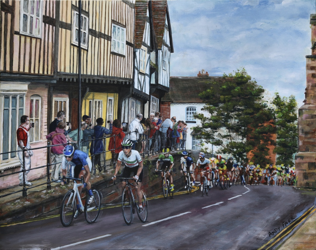
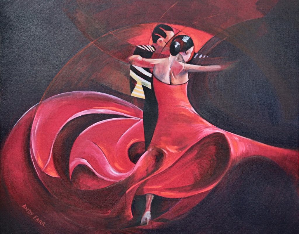
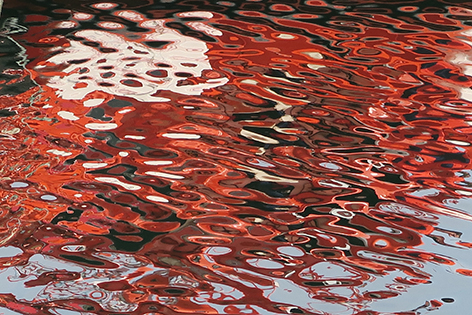
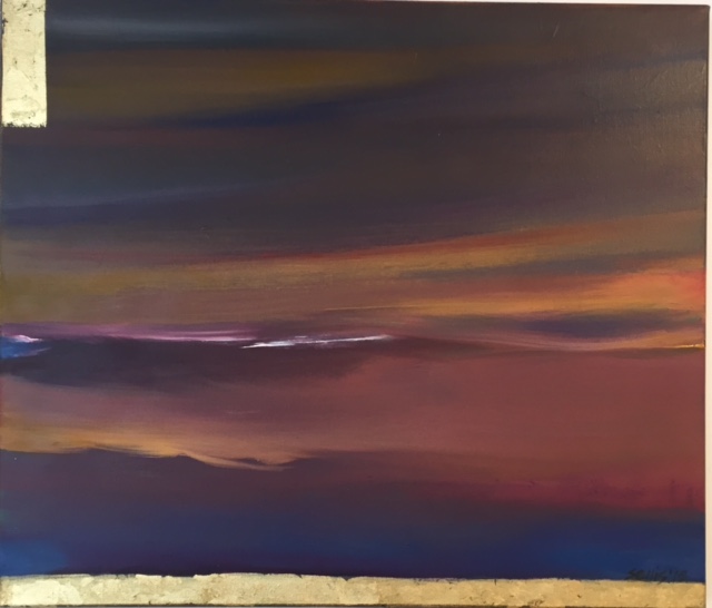
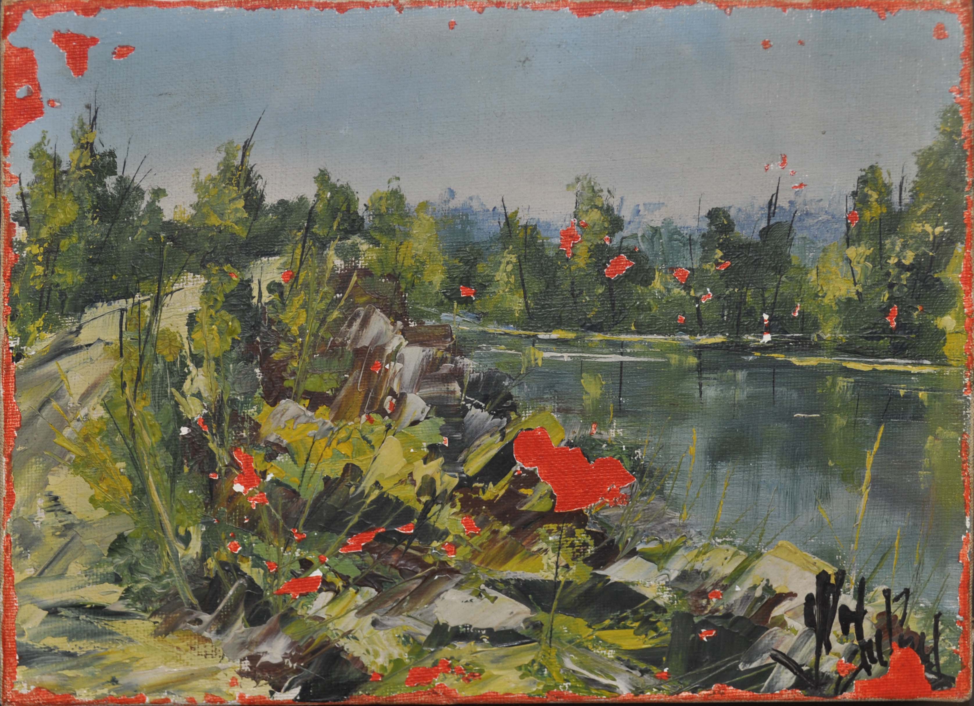
Part-time MA student Andy Farr has just finished showing his work at the Deasil Gallery in Leamington, but they focused on movement and speed and the three here are very different. They are large, and more concerned with social issues, The Third of January 2015 links to Goya’s The Third of May 1808 which is shown on one wall of a room, seemingly looking over New York, and featuring an image from an IS killing on the table. Ideal Home is clearly anything but, a chair laying on its side in another room, and trails of red streaking down the painting. In the third painting, children’s toys merge with more adult videos to draw attention to the loss of innocence. They are accomplished and show his versatility.

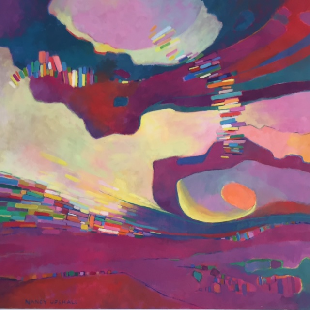
Doris Tissington is also part-time so half way through her studies; her paintings are extremely colourful, involving lots of bright circles and patterns, one seeming almost like a mandala.

Graham Chorlton thanked the students for their commitment to the course and each other, their hard work and spirit of adventure, but he has also clearly brought out the best in them, and it will be interesting to see those who follow.


Movement is the theme of paintings in latest Deasil exhibition

GB Velocity -794x1024-

If you didn’t get enough of the Olympics …. There’s a chance to see it from a different angle in a new art exhibition.

Deasil gallery in Oxford Street, Leamington, is showing Motion and Emotion, an exhibition of Andy Farr’s paintings, until September 8. Andy is keen on capturing movement on canvas, and the show includes a number of works inspired by the recent Rio Olympics, as well as other works.

Andy said he works partly from photographs, but largely from film, watching and re-watching sportspeople in action to come up with his paintings. Many feature expressions of movement, such as Andy Murray’s swinging arm in a tennis shot, or a cyclist whizzing through the frame. Others are like a video that has been moved on frame by frame, showing a sequence of slow motion movements.

Race through Warwick

Pursuit has a single cyclist against a colourful background so you can concentrate on the movement, and Pedal Power has a cyclist in slow motion. Some sailing paintings are slightly different, with a concentration on the different blues and aquamarine colours of the water. Carnival is a painting Andy was unsure about – a celebration of the bright colours of dancing girls in a Rio carnival, a riot of colour as well as movement.

There is also a detailed paintings of a women’s cycle race which came through Warwick earlier this year – for that Andy was there on the street with his camera to capture the riders coming through, and also the spectators lined up opposite with their cameras.

He has previously done a series of works related to dance, saying he wanted to “get a sense of the dance in the painting”. Paso Doble from that series is in this show, a lovely swirl of red dress, embrace and movement.

Andy lives in Leamington, and turned from a career in brand building and marketing to painting a few years ago, and is now studying for an MA at Coventry University’s School of Art and Design, with his degree show coming up shortly. He said some of the sporting works in this exhibition came as light relief compared to paintings of a World War I theme he has done for his MA.

It’s an interesting exhibition and study of sporting superstars showing off their talent.

Paso Doble -1024x801-

Nature Notes offer artists’ varying perspectives on the four seasons

DSC_0393

Michala Gyetvai’s work L’après midi d’une faune

An exhibition inspired by the diary of a well-known local writer aims to explore local wildlife but also has something to offer for the art lover.

Between the taxidermied birds and animals in Nature Notes at The Herbert are artworks, a mixture of new ones and others drawn from the gallery’s store rooms.

The exhibition is described as uncovering the natural world and investigating how wildlife adapts and changes throughout the seasons. There are things to touch and smell, with interactive activities, as well as lots of natural history specimens. The exhibition is split into the four seasons, and there are artworks along the way depicting nature throughout the year.

Yellow-iris-VA196

Yellow Irises by Angela Brazil, © Independent Age and Women’s Careers Foundation

Angela Brazil, the writer of schoolgirl stories who spent most of her adult life in Coventry from 1911-1947, was also a keen watercolour painter of botanical subjects, and there are a number of her works in the exhibition. She also kept a nature diary, and it inspired the exhibition itself. Her works on show include detailed paintings of various types of fungi, wild strawberry plants, yellow iris, hawthorn, and closing with mistletoe and snowdrops.

Warwickshire-based textile artist Michala Gyetvai’s large thread and fibre on wool blanket work L’après midi d’une faune work was inspired by a walk in Hay Wood in Warwickshire, and also music by Debussy and a poem by Stéphane Mallamé. It is a swirl of greens, yellows, blues and purples and looks like nature at the midst of a weather storm.

Gillian Irving’s Summer 2 is a print with images on it including beetles, flies, wild and cultivated flowers laid out as on a specimen table. Margaret Taylor’s pencil drawings of buttercups and daisies are simple, clear and attractive.
Cora Perks’s Willowherb II from 1963 is an oil painting of this early-flowering plant, and a lively mix of red and white whisps.

Moving from summer to autumn, Chelsea Meadow’s lino printed paper from 2015 shows the clear lines of a fox, rabbit and mushrooms. Douglas Hatfield’s Duet or Duo is a dry point etching on paper of owls seeming to speak to each other. October in the Cotswolds is an oil painting by Wilfrid Hawthorn from 1949 of a girl walking down a village lane, with autumn rolling in as shown by some green trees and others where the leaves have already gone brown.

The Pike by Coventry-based Adie Blundell is a more recent work, involving marble, ink, and wood looking a bit like a traditional stuffed and framed fish, but with drawings on it.

For winter, the works include Snow in Tendring Park from 1958, a painting by Hugh Cronyn with the white snow contrasting with dark blue wintry trees and sky, painted with big splatters of colour.
Herbert Cox’s Snow Scene with Hedge is a small and pleasant 1910 painting, with cottages and trees.

In the centre of the gallery Orwell the Owl swoops, made by Chelsea Meadow with wings from old pieces of material, and the perch the base of a Christmas tree.

Whether you find the taxidermy attractive or not there are some interesting and detailed natural and botanical works in this exhibition to make it worth visiting anyway.

CmMgIH4WMAAjhOE

Angela Brazil’s diary, which was the inspiration for the exhibition © The Herbert

Writers cast attractive new light on words from Shakespeare

Well Said_ exhibition_ March 2016_ Karina Thompson_2016_Artworks _c_ artist. Images _c_ RSC._186774

Karina Thompson


The words of the Bard have been held up to scrutiny in a new and interesting way for a Royal Shakespeare Company exhibition in Stratford.

The Paccar room at the theatre has seen a succession of interesting exhibitions from what might seen a limited source, and this is another one.

Writers, actors and poets have been asked what are their favourite lines from Shakespeare, and why they hold them dear, then they have been interpreted as an artwork by a range of artists and craftspeople from different disciplines. The small exhibition has produced an interesting range of work.

In a small side room, playwright Tanik Gupta’s choice from Othello, Act 5, scene 2, features a work by sound artist James Bulley combining Paul Robeson playing the part in 1949, over a musical composition by Samuel Coleridge-Taylor, and a printed representation of the sounds.

Actor Hiran Abeysekera chose lines from Cymbeline and illustrator Jonny Hannah has interpreted them with what looks like a small toy theatre, bright and colourful, with the lines printed on them.

Author Jeanette Winterson picked lines from Act 3 of The Winter’s Tale, and Harrington and Squires have printed them in an open book, large and standing on a wooden circular plinth, explaining their meaning around a suspicion of adultery. Fellow author Margaret Atwood picked Prospero’s musings on life and death …”is rounded with a sleep” for her piece, and it is illustrated by Lara Harwood’s projections of soft images on a light material screen, disappearing into thin air as the words convey.

Comedian, actor and wrapper Doc Brown chose “The course of true love never did run smooth” from A Midsummer Night’s Dream, and The Brilliant Sign Company have turned the words into a Victorian gin palace sign, with brazen, loud lettering on a shiny background. A quote from the same play was picked by actor Ayesha Dharker, and is illustrated by digital collage artist Gareth Courage with four works focusing on eyes, trees and the moon.

Well Said_ exhibition_ March 2016_ The Brilliant Sign Company_2016_Artworks _c_ artist. Images _c_ RSC._186778

The Brilliant Sign Company


Somali performance poet, writer and theatre practitioner Yusra Warsama chose Sonnet 30, which has been interpreted in a film using British Sign Language by Deafintely Theatre Company showing a woman alone in a wood.

It’s interesting to see the quotes picked, and the reasons, and I was pleased to see what would have been my favourite, Caliban’s speech about the island and it’s “sweet sounds”, ending with his feeling that when he waked “I cried to dream again” Textile artist Karina Thompson has machine embroidered many of the words in gold and silver across four squares to bring out the glory of the words; the quote was picked by TV, film and theatre composer Isobel Waller-Bridge.

It’s an interesting exhibition of varying works, giving you a chance to decide for yourself how much you agree with the interpretations of the quotes or not.

An age of dreams and designs is brought back for Compton Verney summer

Cona Rex Coffee Machine - Estate of Abram Games

Cona Rex Coffee Machine – Estate of Abram Games

A time when Britain was trying to shape a new future through stylish designs and dreams of a better life is being revisited for an exhibition.

Britain in the Fifties: Design and Aspiration at Compton Verney will be a trip back to the past for those old enough to have lived through it, and who may have their own feelings about a decade when post-war food rationing did not entirely end until 1954.

Some items will also seem familiar as they enjoy a new popularity through the retro and vintage craze. Others still lasted a long time; there is a display of the original illustrations for the Ladybird book Shopping with Mother by Harry Wingfried from 1958 but the book, with its social and gender stereotyping as noted in the gallery caption, was still popular in the 1970s.

Abram Games is one designer who appears several times. There are his original sketches for the Festival of Britain logo, and the logo itself, along with other festival souvenirs, pamphlets, a scarf and a model of the skylon, the huge structure Winston Churchill apparently ordered to be taken down as it reminded him of the socialist aspirations of the previous Labour government.

Image of Mobiles fabric ref. 220035 Image courtesy of Sanderson www.sanderson-uk.com

Image of Mobiles fabric ref. 220035 Image courtesy of Sanderson http://www.sanderson-uk.com


There are photographs of some of the new homes which were built, focusing on West Point in Allesley Village, Coventry, which still exists. One gallery is hung with beautiful colourful textile designs including influences in fruit and vegetable patterns from William Morris in one by Terence Conran. Another by Robert Stewart oddly features a man riding a fish.

Household gadgets are interesting for their innovation or not – a mechanical potato peeler does not seem to have stood the test of time. A coffee maker designed by Abram Games looks like something elegant but also straight out of a science lab. Ken Wood turns out to be a real person with an electric toaster on show and there is a toast rack by Robert Welch, whose firm also lives on today. There is a table and sideboard set with beautifully elegant crockery by firms including Derby and Midwinter.

In another room, you are invited to sit in a mock up of a 1950s living room to read the newspaper story about the climbing of Everest while watching on a replica TV the Queen’s coronation. More attractive crockery is on show including a cucumber plate.

Elegant looking cars, hiding simple designs, are celebrated through images of vehicles including a Triumph TR2 from 1953, made at Canley, Coventry.

A display of attractive dresses from Horrockses feature an unusual name as one designer; Graham Sutherland took time out from his Coventry Cathedral tapestry design to come up with a printed design dress for Liberty which showed busts of classical characters face to face, and a diagonal neckline and side-buttoning bodice.

Cathedral designer Basil Spence also created a poster promoting rail travel for British Rail, showing his design for it in 1967, several years before it was officially opened. Abram Games also designed a poster showing the shape of the country in railway livery.

Larger items on show include a Mini car, and a small caravan created as a gift for the young Prince Charles and Princess Anne.

The exhibition also draws interesting attention to social change – 90 per cent rented homes in the 1940s, to 60 per cent home ownership by 1959, and the fact that many apparently labour-saving devices actually kept women in the kitchen more. Sadly it seems design itself wasn’t enough to produce massive social change in certain areas.

*On until October 2, 2016.

Designer Sheila’s work finally given spotlight it deserves in exhibition

Immagine Da BTREE (RT)

Wally Dogs

The dedicated life of a designer who forged a long and successful career away from the spotlight is being celebrated – and her wonderful designs receiving a new audience –  nine years after her death.

Rugby Art Gallery & Museum is showing an exhibition dedicated to the life and work of Sheila Bownas, a fascinating textile designer, whose works show the different trends of several decades, and also the struggle to succeed as a woman in design.

Sheila moved from her home in Yorkshire to study at the Slade in London in 1946, then after returning home to teach she continued to do freelance designs for organisations including Liberty and Marks and Spencer. She returned to the capital towards the end of the 1950s, and produced work for the Natural History Museum and Botanical Society of the British Isles amongst others, but then she went back to her home village of Linton where she continued to work as a freelance artist.

She did not however give up hope of getting a job in a studio, as a 1959 letter in the exhibition tellingly quotes: “With reference to your desire to obtain a position in our studio, the director feels that should an appointment be made at all, a male designer would be preferable.

Bownas (below) was ‘discovered’ by Rugby-based Chelsea Cefai who bought an archive of 210 textile design prints from an auction while looking for items to decorate her home, and then set off on a quest to find out more about Bownas. Her research has discovered lots of letters and pictures, loaned from the artist’s cousins and god-daughter, as well as more of her work.

sheila bownas

Some early design works show her Linton, its buildings depicted without perspective. There are portraits, carried out to make money during the Slade years, still lifes which she excelled in, and one painting of her mother and cousin which made it into the Royal Academy’s summer exhibition.

Early textile designs used plant and fern motifs, and there are some beautiful detailed flower paintings. Some items are also borrowed from the Natural History Museum, where Bownas was commissioned in 1962 to make a series of micro-studies to go with a particular exhibition, and these detailed and delicate works show her skill.

Bownas’s sketch book shows the development of her work which often began as a doodle then got advanced into a sketch on baking parchment paper, then a painting.

There are three large walls of the exhibition showing her works from different decades; the 1950-59 section includes patterns, and lots of floral motifs, plus ‘wally dogs’ designed to show the popular mantelpiece ornaments of the time, with increasing use of abstracts and a bus scene, probably inspired by trips to the capital. The 1960s works include very bright colours, and still floral, with the 1970s introducing more geometric patterns and bold colours, and then a set that were just black and white gouache.

It’s a fascinating and well researched exhibition showing the creativity and talent behind a life full of making items that were seen in public, but with the designer staying in the shadows.

*On until September 3, 2016.

Visiting Professor explores travellers through distance and time in exhibition

PM img 3

A Professor of Fine Art from Madrid University is exhibiting in what is now being called the Lanchester Research Gallery

The gallery, which is inside Coventry University’s Graham Sutherland building on the corner of Cox Street in the city centre, is showing Transits and Crossings: New Works on Paper by Pilar Montero, who is currently Visiting Academic Fellow in Visual Arts Research at the university.

The works are divided into three sections, and “explore the aesthetic potential of the contemporary nomadic condition”, with Montero apparently looking back to travellers in eighteenth century Europe: Pasavant in England, Ponz in Holland, England, France and Belgium, and Goethe in Italy, to look at the alienation and pursuit of knowledge that travelling artists confront.

Mirrors is along one wall, a series of attractive photographs of the surface of water from different distances, with something red reflected in it.

Variations of Vocabulary is a selection of pictures of poppies with words flying through, plus dozens of scraps of cloth with words on piled on the floor. Other scraps with words are seen hanging on a washing line.

PM img 1

Little Shoes on Paper is a huge wall covered with what look like tiny, fragile shoes, again with different words written in them, showing a huge attention to detail and craft. Another wall features four large black and white paintings.

It’s an exhibition which makes you think, and it’s good to see the gallery space open again. The exhibition is on until August 19.

The New Art Gallery has a trio of great reasons to visit now

The Garman Ryan Collection at The New Art Gallery in Walsall means it’s always worth a visit, but the temporary exhibitions on at the moment make now an extra good time to go.

The Humble Vessel on the top floor looks at the symbol of the simple boat as depicted by various artists through time, and made relevant now by sights of refugees fleeing so often by boat.

It includes a newly-commissioned work by Pakistani artist Fazal Rizvi, a three-screen video installation of what looks like a small fishing boat from anywhere in the world bobbing about on the water. There are concrete boats which will be going nowhere, by Bob and Roberta Smith, and in an 1873 painting by Jules-Ėmile Saintin a woman in black looks sadly out to sea, a reminder that the waters have often taken lives.

Eric Ravilious’s Storm is a wonderfully blowy, colourful work, and there are other appealing depictions of boats and harbours from the past century. The exhibition ends on July 24, but is worth toiling up to the top floor to visit.

The more recently opened Land, Sea and Air takes as its starting point artists who have used maps as their source material. The exhibition brings together works by seven international artists using maps in very different ways.

You can get pleasantly lost in Frank Bowling’s huge colourful Map Paintings, made between 1967-71 – if you step back parts of the world can be seen through the vivid and attractive colours.

Cornelia Parker’s works show a series of London street maps with burns in them from a meteorite which came down in Namibia in 1836, which has been heated and then burnt over the various locations.

Tiffany Chung’s mixed installation includes photography, a map on the wall showing a timeline, and pieces from history to tell the story of her father, shot down in a mission during the Vietnam war and held prisoner for her entire childhood. It’s a moving and intriguing work.

Shilpa Gupta’s There is No Border Here is very relevant because of recent and ongoing events. It’s a poem on the wall talking of battle, conflict and love, beautifully written in tape which reads “there is no border here”.

These are the highlights of a fascinating exhibition.

Finally, if you think you’ve seen the Garman Ryan collection enough times, think again. As part of a three-year partnership, there are interventions in the collection from the Tate. A total of 16 works from the Tate have been paired with the gallery’s own pieces, related by either artist, theme or subject matter.

It’s fascinating to wander around and read the interesting booklet which investigates the ideas behind these links. Sometimes it’s similarities in theme – there are two paintings of Suffolk with different sky scenes, by John Nash and John Constable, for example.

In other cases it’s the same artist – an oil and a watercolour landscape by Camille Pisarro, and a bronze sculture and ink drawing by Henri Gaudier-Brzeska. There are also other big name artists featured – Picasso, Braque, Rodin, Modigliani, Degas, Gainsborough, Freud, Epstein, Eric Gill, and Odile Redon. One comparison puts a Bernard Leach fruit bowl from 1955 with a Solomon Islands fruit bowl from the nineteenth or twentieth century. My favourite is the huge Raoul Dufy painting of The Wheatfield from Tate paired with a much smaller Harvest Scene watercolour from Walsall.

It’s a great set of exhibitions to enjoy and explore in one building.

Summer is here for artists at Deasil gallery in Leamington, anyway

Sea Moon

The Summer Exhibition at Deasil in Leamington brings together some artists from their stable of regulars whose works are shown in venues such as restaurants around the Midlands, plus some newer artists.

With pieces by about 14 people on show there is quite a variety of themes and styles of working.

Nancy Upshall

Coventry-based artist Nancy Upshall has three pieces here, including the oil painting Twisted Flax, a small work with a concentration on the turns in a material, and a larger work, Motley.

FullSizeRender

Susannah Rourke’s April Showers (above) are four paint and mixed media works of splashes of movement and colour, which can be rearranged into a different pattern if preferred, as can another set called Here I Am.

Chris Putt’s large digital print of St Ives is recognisably the resort, with colour added to the buildings. Stuart Ellis’s Sea Moon (top) has a gold base, with purples, oranges and golds going up into the sky, and is very effective.

Sonia Bublaitis’s works are very colourful, with vivid paint patterns on Perspex. In contrast, Mark Allan is showing close-up wildlife photographs to make the keen amateur envious.

Paul Jordan

Paul Jordan’s City Limits (above) is a mixed media piece, with buildings drawn in black lines over a board on which newspaper has been stuck, and painted over white. You can tell it’s recently done from the headlines about Johnson and May visible underneath.

It’s another enjoyable and varied exhibition from the gallery which changes its exhibitions every three weeks.


Á lui le pompon!

Paysage- G-rard Mermoz

“My first painting in 30 years!” says Gérard Mermoz, with an enigmatic smile, referring to Paysage, which has won the Coventry Open 2016, now on exhibition at the Herbert Art Gallery.

In fact, Mermoz – artist, curator and provocateur – has subjected the notion of painting and the aura of the individual work of art to multiple levels of deconstruction, with the crucial involvement of the exhibition’s organisers at Culture Coventry.

The work is an appropriation – a ‘found’ painting complete with indecipherable signature, subjected to some interventions by Mermoz, chiefly with a sharp implement. For the exhibition poster, and the brochure, the gallery has severely cropped this rather small painting, converting it from landscape to portrait format.

Then, in his speech at the opening Chris Kirby, director of exhibitions at Culture Coventry, called the work ‘Passage’ – a term freighted with significance. This is not so much a work in the Coventry Open, as a work involving the Coventry Open.

The neo-conceptual project, with its subversion of the art object, is widely regarded as having long ago run it course. This splendid collaboration suggests that there may still be just a flicker of life in the genre.

(This was an intervention in the landscape of this blog.)