Month: October 2017

Andrew Logan’s exhibition brings glitz to peaceful Abbey setting

Sometimes you just want something glittery and shiny to brighten up your life, and thank goodness for Andrew Logan for providing that.

Andrew Logan’s Goldfield

Logan is famous as the founder of the Alternative Miss World in 1972 and as a sculptor, jewellery maker and artist. I was also lucky enough to see him escorting Zandra Rhodes to the press day of the Chelsea Flower Show a few years ago, and the pair were so colourfully dressed they were competing with the floral displays for attention; fitting for an artist whose Wikipedia entry also includes the description “self promoter”.

Logan has an exhibition of his work at Buckland Abbey in Devon on show until the end of October, and on a grey day my heart was lifted by a visit.
Buckland Abbey was built in 1278, one of the last of the Cistercian monasteries to be build in England and Wales, and after the dissolution was sold on to Sir Francis Drake.

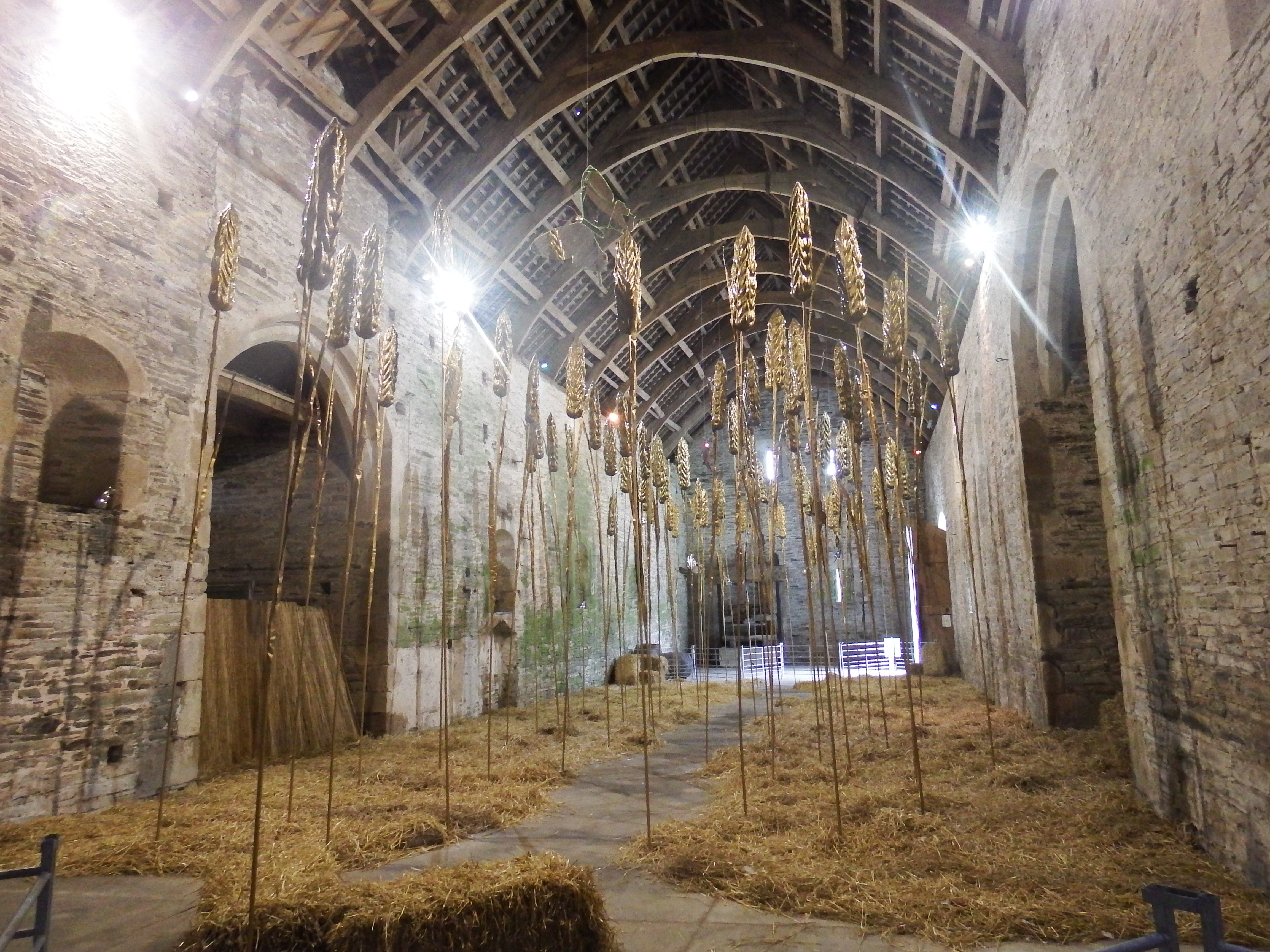
The Abbey’s impressive Great Barn (fittingly named) is filled with Goldfield, an old work on show for the first time in 41 years featuring huge golden sheaves, given lots of space amongst piles of straw in the ancient building.
Nearby, Excalibur features the sculpted hand and sword rising from the lake.
In the Abbey house itself, there are works large and small to delight. Three shiny, mirror-clad, horse sculptures, Pegasus – Birth, Life and Death start the journey on the ground floor, along with a self portrait of Logan made mainly from glass too.

Pegasus by Andrew Logan

On the first floor, amongst the house’s Sir Francis Drake collection of exhibits there are pieces of Logan’s shiny jewellery, and Dinner with Andrew and Friends features a Rhodes-designed tablecloth, plus other paintings and sculptural works by mostly unnamed friends.

The Zen Garden is a representation on a table top of the Kyoto garden, and is designed to be restful and visitors are encouraged to sit and contemplate; sadly the noise of Abbey volunteers and staff in their room next door made that a bit difficult!

Down in the kitchen, Humpty Dumpty, a shiny little creation, sat in the oven waiting to be discovered. In the Great Hall, thrones used in Alternative Miss World were glamorous and enticing, and Altar Cross was on show appropriately in the chapel, and didn’t look out of place.

Andrew Logan’s exhibition is called The Art of Reflection, and he wrote that he hoped it would enthral and surprise visitors. It certainly made me smile, and added an extra fun element to a beautiful destination.

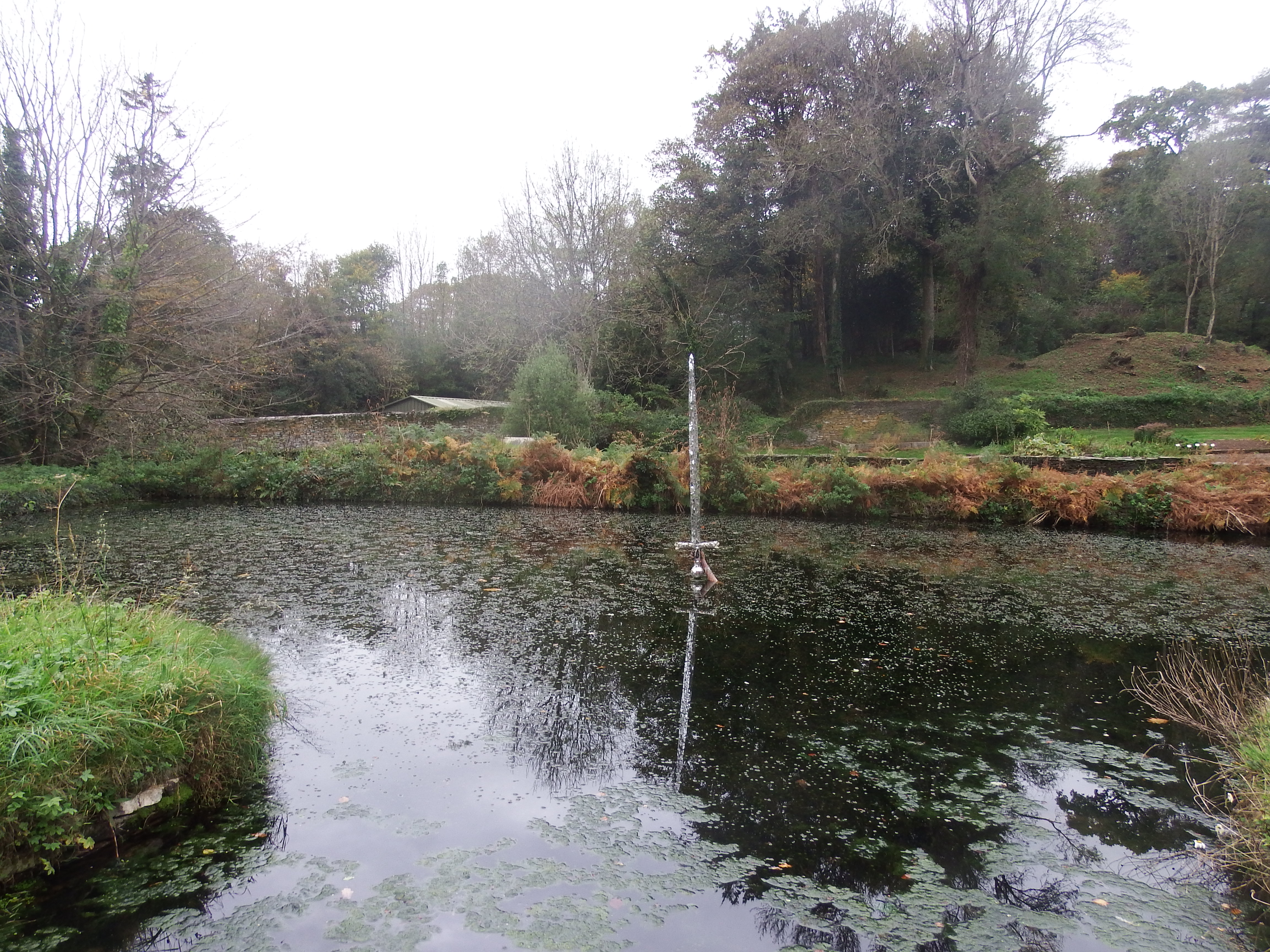
Excalbur by Andrew Logan

Advertisement

Artist and writer go back to nature to explore children’s Lost Words

Dandelion -R Jackie Morris r

Dandelion by Jackie Morris

It’s a sobering fact, quoted in the introduction to a new exhibition at Compton Verney Art Gallery & Park, that three quarters of British schoolchildren spend less time outdoors than prisoners.


And that a survey found that eight – 11 year olds were better able to identify types of Pokemon characters than types of UK wildlife. It’s impossible too not to think of recent news reports about the rise in childhood obesity rates and see how these things like together.

The exhibition The Lost Words is inspired by these findings, and is a collaboration between writer Robert Macfarlane and illustrator Jackie Morris.

And at least you have to get some exercise walking through the beautiful Capability Brown-designed parkland at Compton Verney to see the show.

Macfarlane has written a series of poems each named after a bird, animal or plant and Morris has painted two or three watercolours to go with each. The poems are acrostic – the first letter of each sentence spells out the name of the subject of the poem.

Subjects include bramble, wren, willow, magpie, starling, raven and adder. In most cases there is a beautiful illustration on goldleaf of the creature, then another watercolour of it in motion; there are small birds amongst foliage, two otters circling each other in a pool, a family of kingfishers waiting to be brought food, and a heron in flight, amongst the 50 works. There are also some others, showing the path of the creature for example. In some, there’s a magical, mystical nightime scene.

Morris seems to excel specially at birds, and it’s an attractive, entrancing exhibition, which should send you back into the park to see what you can spot down on the water in particular.

The Wild Washerwomen, Quentin Blake

Also at Compton Verney until December 17 is Quentin Blake – Inside Stories, in which the illustrator explains how he works, and the stories behind some of his best-loved creations. The exhibition includes his own explanations of how he has put together the pictures for stories by writers as varied as Roald Dahl, Michael Rosen and the eighteenth century’s Voltaire (he produced an illustrated version of Candide).

There are initial drawings, and then the fully-completed illustrations on show.

There are more than 140 works on show, including the drawings used in books such as Dahl’s The Twits and BFG, and David Walliams’s The Boy in the Dress. Others, such as The Wild Washerwomen, are less familiar, to me anyway.
The exhibition is sure to delight the many fans of Quentin Blake’s work.

Kaleidoscope of colour or limited palette – exhibitions explore both

Two current Midlands exhibitions couldn’t be further apart in their titles. At the Mead Gallery at Warwick Arts Centre there is Kaleidoscope, Colour and Sequence in 1960s British Art, and at The White Room Gallery in Leamington is Black and White.

The Mead’s exhibition is a touring exhibition from the Arts Council Collection, and exhibition info says it “brings into focus the relationship between colour and form, rationality and irrationality, order and waywardness in art of the 1960s.”

The point is also made that the featured artworks include bold, artificial colour, and capricious shapes, but also a lot of order, sequence and symmetry.

Walking into the exhibition and looking across at the works in one sweeping gaze, the colours and varied shapes leap out, and the first impression is of some sensory room aimed at stimulating the senses, or even a large play area for children.

Richard Smith’s Trio from 1963 is an orange, yellow, blue and white oil painting showing his influence by American abstract impressionism. There’s also an inevitable op-art black and white work, Movement in Squares, by Bridget Riley from 1961.

A small painted steel sculpture is Anthony Caro’s contribution, and Thebes is the work on show by William Tucker, consisting of three triangular shapes in red, yellow and blue reflecting his work in the 60s on repeated units which must all sit on the ground.

Robin Denny’s Over Reach is a canvas with large straight areas of colour, and John Hoyland’s 15.5.64, named for a date, features bright colours combined.

Tim Scott’s Quinquereme is a mix of geometrically-shaped pieces of acrylic, and Philip King’s Point X is a large structure using squares, circles and triangles to create a symmetrical but also oddly shaped design.

All together there are works by more than 20 artists in this exhibition, spanning, as the publicity says, Op Art, Pop, Constructivism and New Generation sculptures. It’s interesting to read in the excellent exhibition guide what they were exploring and trying to achieve and ponder 50 years on if they achieved it. The exhibition runs until December 9.

Meanwhile in Leamington Spa, the White Room Gallery is staging Black and White, an exhibition bringing together monochrome works by a range of artists from the local to internationally famous. The items featured cover a range of media including etchings, photographs, silk screens, oils and lithographs.

It features amongst others a diamond dust limited edition print of Damien Hirst’s For the Love of God, a large diamond-studded skull.

There’s also a print of Lamp and Lung Ch’uan Ware by Patrick Caulfield, an artist I always associate with bright colours and it’s hard to see this work of a lamp and vase in shades of white and grey.

Antoni Tàpies’s L’apocalisse del opera is a strange abstract in black and white, and there is a Picasso print of Henry VIII After Holbein, a startled looking image which is an unusual one to be associated with Picasso.

There’s a Rachel Whiteread work, Ringmarks, showing wine glass-type marks on laser-cut plywood.

Locally-based artists who feature include Horace Panter, with one of his Robot series in monochrome, and photographer Ray Spence’s Reflection of a woman reflected in glass. Tim Southall who has exhibited at the White Room before is showing a Venice sea and landscape with lots of detail.

It’s a show of some interesting works, though linked only by their use of black and white, and does rather leave the visitor crying out for more colour in the world outside.