Author: Julie Chamberlain

I'm a freelance journalist and PR writer living, writing and working in Coventry. One of my interests is art, and this is my blog about the art world of Coventry, Warwickshire and beyond - and occasionally the other good things in life. Follow me on Twitter @JulieinCov

Queen Victoria, Paris and Picasso are unlikely mix of stars for Compton Verney autumn exhibition


max-berthelin-royal-visit-to-napoleon-iii-the-grande-galerie-des-fetes-at-the-hotel-de-ville-paris-23-august-1855-royal-collection-trust-2016

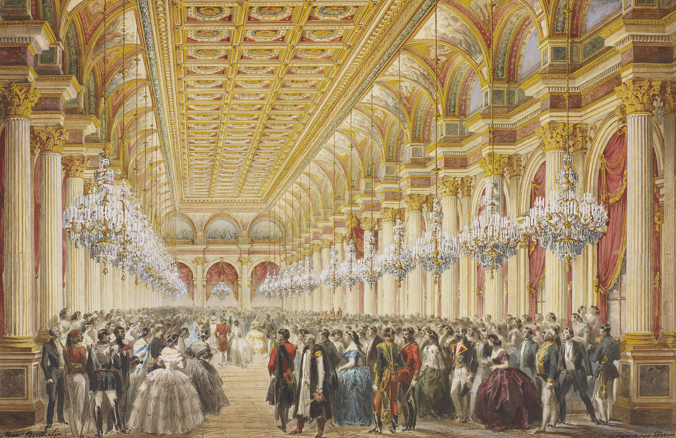
Max Berthelin, Royal Visit to Napoleon III, The Grande Galerie des Fetes at the Hotel de Ville, Paris, 23 August 1855, Royal Collection Trust 2016

Two contrasting exhibitions end the year on a high for Compton Verney art gallery in south Warwickshire.

Queen Victoria in Paris features watercolours from the Royal Collection, and Picasso on Paper: Prints from the collection of the Museum Kunstpalast, Dusseldorf, is self explanatory.

The Victoria exhibition is an unexpected joy. It features 44 watercolours which are from three different sources. In 1855 Napoleon III sent Victoria 10 watercolours depicting her visit to Paris from 18-27 August that year, she then commissioned 15 more and the final ones were sent by Baron Haussman. They are seen together in this touring exhibition for the first time – and some have never been seen before in public. The occasion marked the first time Britain and France were fighting on the same side, in the Crimean War, and only 40 years after the Battle of Waterloo.

Compton Verney has done what it does well with this exhibition, presenting them in rooms painted a gorgeous deep blue, and with the low lighting required to protect them.

charles-auguste-questel-royal-visit-to-napoleon-iii-the-illuminations-in-the-gardens-in-the-gardens-of-versailles-25-august-1855-royal-collection-trust-2016

Charles Auguste Questel, Royal Visit to-Napoleon II, The Illuminations in the gardens of-Versailles, 25-August 1855, Royal Collection Trust, 2016

This is a collection where the names of the artists are less important than what is shown or represented. Indeed in some of them, the architecture of the buildings, inside and out, is what is particularly impressive – and apparently that was entrusted to architecture students to draw. There are scenes inside from various parties, including at the Hôtel de Ville, where there were 7,000 guests, and the high ceilings and decoration inside is impressively shown; regular artists painted in the people in the bottom part of the frame.

william-wyld-chateau-de-saint-cloud-royal-collection-trust-2016

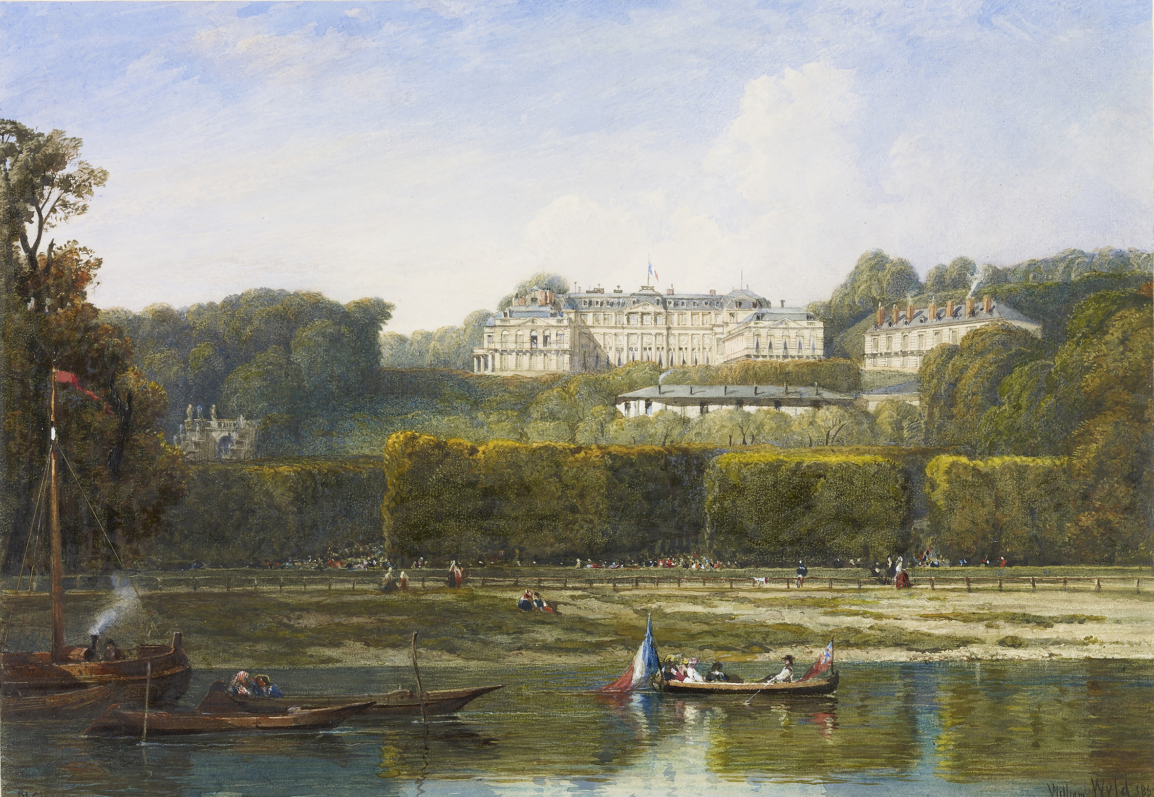
William Wyld, Chateau de Saint Cloud, Royal Collection Trust, 2016

Victoria’s visit is depicted from her arrival in the Royal Yacht at Boulogne, through to a huge welcome in Paris, through a fake ceremonial arch built temporarily for the occasion. There are landscapes of Saint-Cloud, where she stayed, and which was razed to the ground when Napoleon III fell in the Franco-Prussian war of 1870, and some gorgeous interiors of the rooms, with Victoria and Albert shown reading in one. The detail of the rooms and of clothes and hairstyles will delight those interested in the era.

There’s a fantastic nightime painting of Versailles, a packed visit to the opera, and an exaggerated image of Victoria inspecting troops on a massive parade ground. The third room is dedicated to 19 scenes from the Hôtel de Ville ball. It’s an exhibition which is a delight in many different ways.

The Picasso exhibition features 70 works from the Dusseldorf collection, created over a period of 40 years from the 1920s-60s. The exhibition seems to work in phases, marked by Picasso’s changing women, and professional collaborators.

7-pablo-picasso-head-of-the-faun   3-pablo-picasso-francoise

Pablo Picasso, Head of the Faun, Colour Linocut, Edition 19/50, Stiftung Museum Kunstpalast, Düsseldorf © Succession Picasso/DACS, London 2016. Photo: Stiftung Museum Kunstpalast, Düsseldorf, Horst Kolberg, ARTOTHEK and

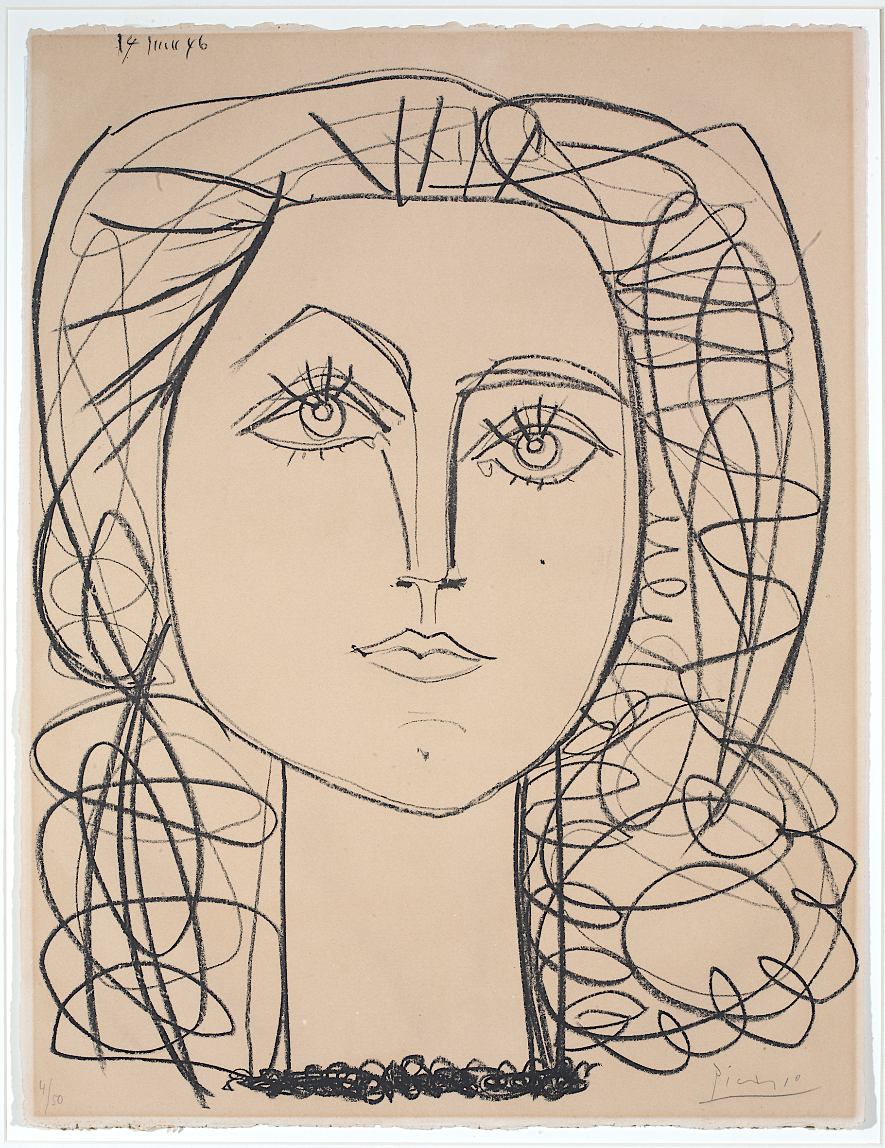
Pablo Picasso, Françoise, 14.06.1946, Lithography, Edition 4/50, Stiftung Museum Kunstpalast, Düsseldorf © Succession Picasso/DACS, London 2016. Photo: Stiftung Museum Kunstpalast, Düsseldorf, Horst Kolberg, ARTOTHEK

There is a portrait of Jacqueline Roque, who featured in more than 400 of his works, and also marked the start of his collaboration with Hidalgo Annéra.

There are some cute images of his young children, Paloma and Claude, the outlines of one created with his fingertips as he didn’t have tools to hand. Motherhood is an etching, with a few simple lines creating perfectly the woman and the young boy she is feeding. The Painter on the Beach from February 3, 1955 is a humorous work of several odd characters posing.

La Tauromaquia is a seires of 16 aquatint and sugar lift works showing simple scenes of bullfighting, and there is another series, Poèmes and Lithographs, featuring portraits and stream-of-consciousness text.

A move from Paris to the south of France resulted in a new collaboration with a potter there, and there are some works loaned from Leicester Arts and Museums Service, including the lovely Yellow Face of 1947, with the sweet face drawn with his fingers again.

So clearly a pair of exhibitions with no connection, but both interesting in their own right – and on until December 11.

The Human Document makes engrossing study of suffering and desperation

humandoc3

Photographs of people facing despair and suffering, decades and thousands of miles apart, make up the engrossing exhibition The Human Document.

Subtitled The Photography of Persuasion from 1930s America to Present Day, the exhibition at the Mead Gallery, is based largely on works shown at a 1962 New York Museum of Modern Art exhibition, The Bitter Years.

This used 200 images taken in the 1930s by a group of photographers working for the Historical Section of the Farm Security Administration Programme, with the aim of proving to better-off Americans the desperate state of rural communities and the need for the New Deal programme.

During the Second World War 70,000 prints and 170,000 negatives were transferred into the Library of Congress in Washington (and many are now available to be downloaded).

This exhibition shows many of the images from The Bitter Years exhibition, alongside photographs by contemporary photographers also documenting sides of life that would otherwise remain hidden to many people.

humandoc4

The American photographs are fascinating. All small and black and white, they show an unimaginable life. In the first image inside the door, by Arthur Rothstein, two wagon wheels lie in a pile of dust in front of abandoned farm, making the point that the resident of the shack behind isn’t going anywhere useful on their cart any more. Rothstein’s other images include an animal skull on cracked ground, and a withered crop. He also showed people being forcibly moved from living alongside a road to land between the Mississippi and the levee, and abandoned furniture of those on the move.

Marion Post Wolcott’s Old Negro shows a miserable man picking at a thread on his worn clothing. Ben Shahn has captured images of destitute Ozark people in Arkansas, including a girl clutching a damaged doll, itself wearing rags, and a little boy cuddling two kittens, his clothes as ragged as the those of the doll.

Dorothea Lange’s many images are some I kept returning to. She has photographed a sharecropping family on the move, mum in a bonnet clutching her baby, a sad little boy and anguished father.

She also pictured black cotton pickers, who worked from 6am-7pm for $1, and the image is hung next to another of hers, showing a fat white plantation owner with his car; the documentary and persuasive nature of the photographs is important to note too.

However it wasn’t as simple as black vs white; a white tenant family’s home is shown, a plain bed on the porch of a house propped up with bricks. Lange is particularly good at capturing images of young mothers, old before their time, trailing across the country with their husbands and children in search of any sort of better life.

humandoc1

Her photograph of the 32-year-old ‘migrant mother’ of seven children, Florence Thompson, pictured (above) with a baby and two young children in a pea picking camp, became a famous image, her tough life leaving her looking more like 45, and is included here, as well as a fascinating interview with Florence in the accompanying free catalogue. Despite her incredibly hard life she lived to 80, though her own mother had made 108.

Lange also photographed an old woman in Kern County migrant camp in California, her only comfort a rocking chair in an open-fronted tent.

There are countless images here all showing homelessness and suffering seen many times around the world, including of course now on the daily news.

The works by contemporary artists are mostly also from the west, and show a side of life missed by many. Three sets stand out.

Chris Killip’s photographs from the north of England from the 1970s-90s, show bleak back streets in Tynemouth, and what appear to be travellers but are specifically sea coalers, people who harvest then sell washed-up coal. Their messy camp and a little girl playing with a hoola-hoop next to a burnt-out fire and wrecked furniture document a difficult way of life at the time.

Paul Graham’s colour collection, Beyond Caring, is made up of covertly-taken photographs of people in social security offices. Fed-up faces, and bored body language dominate here. People forced into a community in the offices where they don’t communicate with anyone.

Richard Billingham’s Ray’s A Laugh series are painful for the knowledge they feature his own family. His dad falls from a chair in their cramped flat, or glares at a cat hissing on a cabinet cluttered with ornaments. His mum hand feeds a kitten, and his brother licks yoghurt from the lid of a basic brand.

Different times, and different viewpoints set the more recent works apart, but it’s a show not to be missed for work by talented photographers capturing images from the times they lived in, and looking to tell a story to others.

* Mead Gallery, Warwick Arts Centre, University of Warwick, until December 10.

Standard ideas of homes and bodies are turned inside out in interesting exhibition

Outside / Inside / Out is the title of a new exhibition by two Coventry-based artists showing their work in Warwickshire.

The works, on show at the Lewis Gallery at Rugby School, only until October 13, are by Mandy Havers, a Senior lecturer in Fine Art at Coventry University, and Andrea Hannon, who completed her PhD at the University in 2014, and was also one of the artists highlighted in New Art West Midlands that year.

They explain the title of the exhibition as “the notion of external and internal space as it is found, negotiated and experienced both physically and psychologically is an interest both artists share”. However their works are very different.

Mandy’s works largely concentrate on the human body, often in its most physical form, but with what should be inside and unseen very much on show. Some of the works appear beautiful but in a gory way; Bloodpool features a doll-like figure sitting on a red shiny ball, but then you realise its guts are spilling out of its middle and making the pretty lines down the ball.

Gold Head is a tightly stuffed leather gold head. Last Supper is a large leather and mixed media work, with a Jesus face looking out, some shiny bling, and then you realise the central body is a large loaf of crusty bread.

Dreamer is a work seeming to feature a foetus attached to a head, and other works show detailed drawings of cut-away people, their internal organs and veins visible. There are also a number of tables showing collected objects, Dreamworld from this year, features odd collections; dolls with outsized gloves suck on their hands, eyeballs, and other items relating to the body. The whole body of work is accomplished, attractive and also disturbing in parts.

Andrea Hannon’s works also vary between some on the wall and others free-standing. Her works concentrate more on the idea of physical spaces and the idea of home.

Postern is two landscape paintings, with her own collaged intervention of what looks like windows and walls.

Cluster I is a set of three 3D collages in Perspex and wood, so you can see inside to tiny figures cut from old books, wearing masks here, and with a city skyline too. In Cluster II people gather around a desk. Shoot features four images of what look like a woman in an attractive dress, but with swirls of pattern around her, distracting from the figure.

In-her is a roughly-made dolls house inhabited by cut-out figures, including one that looks like a woman doing the ironing, and in one part of the house the floor has come up in strips, and the front is completely detached, suggestion traumas and frustrations of home. Two other works feature homely items such as lampshades and wallpaper in unusual settings on the floor.

The very different works seem to complement each other, creating an interesting and thought-provoking exhibition.

*The Lewis Gallery opens weekdays 2-5pm, and the exhibition closes on Thursday, October 13.

New exhibition tells of life on the front line for Warwickshire woman

painting-dorothie

A drawing of Lady Dorothie Feilding by General Hely d’Oissel (Warwickshire County Record Office, CR2017/c582/81)

A new exhibition at Rugby Art Gallery and Museum tells the story of a brave local woman who left behind a life of privilege to help save people on the frontline of the First World War.
Lady Dorothie Feilding was the daughter of the Earl of Denbigh and grew up on the family estate at Newnham Paddox, near Rugby, with six sisters and three brothers, two of whom were killed fighting in the war.
In 1914, when she was 24, she travelled to France as a member of the Munro Ambulance Corps after completing her training at the Hospital of St Cross in Rugby. Belgium was the only country to allow women to work on the front line, so she was soon in Flanders. Dorothie’s aristocratic background also helped in gaining her this dangerous but obviously wanted job; she had three patrons, including a general whose daughter she had been with at a Paris boarding school, and another whose son had married one of her school friends.
Her daily round of picking up the wounded is detailed, and there are pictures of Dorothie, sometimes casually in the background, and other times obviously feted as someone important. In one photo she was next to a shell, in another lounging in a chair in a bomb-damaged house, and another with her little dog, who she returned to at night for a cuddle to escape the horrors of war.

Letters and photographs relating to the First World War by Dorothy Feilding.

Letters and photographs relating to the First World War by Dorothy Feilding.

This is more of a historical exhibition than an art show, with photos, letters, maps, drawings and information boards, though there are some attractive drawings friends and admirers drew of Dorothie at work.
She was on the front line from 1914-17, and was awarded the French military honour of the Croix du Guerre, and was made a Knight of the Order of Leopold I in Belgium, finally being awarded the Military Medal by the British Army.
Dorothie became engaged to an Irish captain in 1917, her engagement recorded on the front page of the Daily Sketch with a reference to her as “our Joan of Arc”, and photos of her.
After all her bravery during the war, it’s then rather sad to read that she did not live a long life; Dorothie married, lived in Ireland and had five children, before dying of heart failure aged only 46. She was brought back to Monks Kirby for burial in the Roman Catholic cemetery there.
*The exhibition is on until October 29, 2016.

High standard of works are on show in first Coventry University MA Painting exhibition

The inaugural exhibition of the MA Painting course at Coventry University has ended on a high with an exhibition of works by the first graduating students – and they have set the bar high for those that follow.

The top floor of the Graham Sutherland building on the corner of Cox Street in the city centre is the venue for the show, open Saturday, September 10 and Monday-Wednesday 12-14, and it is worth detouring to see (if you can get in the building). There are works by just three full-time and two part-time students.

The works that drew me in most were by Zhen Zhai, who also calls herself Dakota Zuch, and who comes from the south of China. She has created a number of paintings of life in China for two very different groups of people. Some of the works are ‘normal’ painting-size, but there are also dozens of small postcard-sized ones with an extraordinary amount of detail.

The whole collection is called They Don’t Want to Live With Grandparents. Some paintings feature the glamour and wealth of the big city, where a bright highway cuts through dark sky scrapers, and contrasts with village scenes of poor homes and pylons, trucks in quarries, and people gathering berries or selling fruit by the roadside. Zhen Zai told me they were about the children left behind with grandparents when parents went off to the cities for work. They stayed poor, whereas the children that grew up in the cities were rich – shown in these images of university graduation, glamorous hotels and schools. She had been to the rural north to meet the children left behind, some of whom didn’t even know what the glasses on her face were. The poignant story has created some confident, skilled paintings; Zhen is returning to China to complete another MA there.

Matthew Morrison Macaulay’s work is familiar from previous exhibitions in the city, but studying for the MA has led him to rethink and look anew at paintings, and he said this collection is “paintings about paintings”. In particular he had become interested in Manet’s Portrait of Mademoiselle Claus from the Ashmolean in Oxford. Some of his works feature lines bisecting them, and this comes from the balcony and shutters in the picture, and there’s also more blurring of colours and seemingly smudging over “in a Richter-esque way”. It’s interesting to see where his works will go in his future studies.

Susa Lee works with textiles and paintings; some, which she said come from her imagination, showed cats in colourful, abstract scenes, plus one which brought back nightclub memories. The textile works involve cutting, painting and arranging in flag-like ways. She said the MA had been all she hoped it would be, and said she has realised she has to see other people’s artworks ‘live’ to be inspired by them.

Part-time MA student Andy Farr has just finished showing his work at the Deasil Gallery in Leamington, but they focused on movement and speed and the three here are very different. They are large, and more concerned with social issues, The Third of January 2015 links to Goya’s The Third of May 1808 which is shown on one wall of a room, seemingly looking over New York, and featuring an image from an IS killing on the table. Ideal Home is clearly anything but, a chair laying on its side in another room, and trails of red streaking down the painting. In the third painting, children’s toys merge with more adult videos to draw attention to the loss of innocence. They are accomplished and show his versatility.

Doris Tissington is also part-time so half way through her studies; her paintings are extremely colourful, involving lots of bright circles and patterns, one seeming almost like a mandala.

Graham Chorlton thanked the students for their commitment to the course and each other, their hard work and spirit of adventure, but he has also clearly brought out the best in them, and it will be interesting to see those who follow.


Movement is the theme of paintings in latest Deasil exhibition

GB Velocity -794x1024-

If you didn’t get enough of the Olympics …. There’s a chance to see it from a different angle in a new art exhibition.

Deasil gallery in Oxford Street, Leamington, is showing Motion and Emotion, an exhibition of Andy Farr’s paintings, until September 8. Andy is keen on capturing movement on canvas, and the show includes a number of works inspired by the recent Rio Olympics, as well as other works.

Andy said he works partly from photographs, but largely from film, watching and re-watching sportspeople in action to come up with his paintings. Many feature expressions of movement, such as Andy Murray’s swinging arm in a tennis shot, or a cyclist whizzing through the frame. Others are like a video that has been moved on frame by frame, showing a sequence of slow motion movements.

Race through Warwick

Pursuit has a single cyclist against a colourful background so you can concentrate on the movement, and Pedal Power has a cyclist in slow motion. Some sailing paintings are slightly different, with a concentration on the different blues and aquamarine colours of the water. Carnival is a painting Andy was unsure about – a celebration of the bright colours of dancing girls in a Rio carnival, a riot of colour as well as movement.

There is also a detailed paintings of a women’s cycle race which came through Warwick earlier this year – for that Andy was there on the street with his camera to capture the riders coming through, and also the spectators lined up opposite with their cameras.

He has previously done a series of works related to dance, saying he wanted to “get a sense of the dance in the painting”. Paso Doble from that series is in this show, a lovely swirl of red dress, embrace and movement.

Andy lives in Leamington, and turned from a career in brand building and marketing to painting a few years ago, and is now studying for an MA at Coventry University’s School of Art and Design, with his degree show coming up shortly. He said some of the sporting works in this exhibition came as light relief compared to paintings of a World War I theme he has done for his MA.

It’s an interesting exhibition and study of sporting superstars showing off their talent.

Paso Doble -1024x801-

Nature Notes offer artists’ varying perspectives on the four seasons

DSC_0393

Michala Gyetvai’s work L’après midi d’une faune

An exhibition inspired by the diary of a well-known local writer aims to explore local wildlife but also has something to offer for the art lover.

Between the taxidermied birds and animals in Nature Notes at The Herbert are artworks, a mixture of new ones and others drawn from the gallery’s store rooms.

The exhibition is described as uncovering the natural world and investigating how wildlife adapts and changes throughout the seasons. There are things to touch and smell, with interactive activities, as well as lots of natural history specimens. The exhibition is split into the four seasons, and there are artworks along the way depicting nature throughout the year.

Yellow-iris-VA196

Yellow Irises by Angela Brazil, © Independent Age and Women’s Careers Foundation

Angela Brazil, the writer of schoolgirl stories who spent most of her adult life in Coventry from 1911-1947, was also a keen watercolour painter of botanical subjects, and there are a number of her works in the exhibition. She also kept a nature diary, and it inspired the exhibition itself. Her works on show include detailed paintings of various types of fungi, wild strawberry plants, yellow iris, hawthorn, and closing with mistletoe and snowdrops.

Warwickshire-based textile artist Michala Gyetvai’s large thread and fibre on wool blanket work L’après midi d’une faune work was inspired by a walk in Hay Wood in Warwickshire, and also music by Debussy and a poem by Stéphane Mallamé. It is a swirl of greens, yellows, blues and purples and looks like nature at the midst of a weather storm.

Gillian Irving’s Summer 2 is a print with images on it including beetles, flies, wild and cultivated flowers laid out as on a specimen table. Margaret Taylor’s pencil drawings of buttercups and daisies are simple, clear and attractive.
Cora Perks’s Willowherb II from 1963 is an oil painting of this early-flowering plant, and a lively mix of red and white whisps.

Moving from summer to autumn, Chelsea Meadow’s lino printed paper from 2015 shows the clear lines of a fox, rabbit and mushrooms. Douglas Hatfield’s Duet or Duo is a dry point etching on paper of owls seeming to speak to each other. October in the Cotswolds is an oil painting by Wilfrid Hawthorn from 1949 of a girl walking down a village lane, with autumn rolling in as shown by some green trees and others where the leaves have already gone brown.

The Pike by Coventry-based Adie Blundell is a more recent work, involving marble, ink, and wood looking a bit like a traditional stuffed and framed fish, but with drawings on it.

For winter, the works include Snow in Tendring Park from 1958, a painting by Hugh Cronyn with the white snow contrasting with dark blue wintry trees and sky, painted with big splatters of colour.
Herbert Cox’s Snow Scene with Hedge is a small and pleasant 1910 painting, with cottages and trees.

In the centre of the gallery Orwell the Owl swoops, made by Chelsea Meadow with wings from old pieces of material, and the perch the base of a Christmas tree.

Whether you find the taxidermy attractive or not there are some interesting and detailed natural and botanical works in this exhibition to make it worth visiting anyway.

CmMgIH4WMAAjhOE

Angela Brazil’s diary, which was the inspiration for the exhibition © The Herbert

Changing face of BBC comedy is a good lesson in laughter

Steptoe and Son, Harry H. Corbett as Harold Steptoe, Wilfrid Brambell as Albert Steptoe & Duncan Wood with various cast members & studio crew, 1965, Copyright BBC

Steptoe and Son, 1965, Copyright BBC

The developing face of comedy on the BBC from the 1950s to the present are examined in an exhibition in Warwickshire.

BBC Faces of Comedy at Compton Verney contains nearly 100 photographs from the BBC archives, and it’s amazing how many from the earlier section are still household names, or popular faces from repeats, today.

The early selection mostly of course covers BBC radio, and starts in the 1930s. A 1938 shot shows the actor Carey Grant guest starring on Band Wagon. The star of It’s That Man Again Tommy Handley is shown standing on his head for a promotional photo to look suitably zany.

Joyce Grenfell and Tommy Cooper, complete with fez, are in later images and there’s a very young Bruce Forsyth from 1959 starring in Educating Archie. Amazingly, this was a successful radio programme featuring a ventriloquist’s doll, but it only lasted a year when it moved to TV as viewers complained they could see the ventriloquist’s lips move!

The Frankie Howerd Variety Show from 1951 features him and Eric Sykes hamming it up, and Howerd pretending (presumably) to be asleep in a script conference. The Goon Show stars sit almost one on top of each other for a photo pulling daft faces, and Hancock’s Half Hour is represented by a lounging Hancock having his hair combed by Hattie Jacques with the other stars sat around attentively.

A young Morecambe and Wise are featured in conversation in 1957with Morecambe dangling a pipe from his lips; apparently their first attempt to transfer to TV was unsuccessful, but they came back three years later for another go and the rest was history.

Ken Dodd had perfected the look he’s had ever since by 1958, with his mad hair and dazed expression, and Kenneth Williams was looking camply askance in a Beyond our Ken picture from 1958.

These early photos differ from the more recent in that the images are mostly more outrageously posed and staged, with the comedians trying to appear the same way they put themselves over on radio or early TV. The later ones sometimes show the actors in character, but others are behind the scenes or during down time.

Lifes Too Short- Ricky Gervais - Stephen Merchant- production shot- S1 Ep1  2011- Copyright BBC

Life’s Too Short, Ricky Gervais and Stephen Merchant production shot, 2011, Copyright BBC

They still represent the passing decades though; there’s The Liver Birds pictured in 1969 with their hairstyles and clothes very much of the time, several photos from Dad’s Army, and Are You Being Served?, showing different sets in the studio. Fawlty Towers has the stars very much in character, as does the Young Ones. In Only Fools and Horses the stars are shown relaxing on set and being filmed on a boat, and the Absolutely Fabulous stars are shown in costume but off duty in Paris. Ricky Gervais and his University of Warwick-graduate co-writer Stephen Merchant are shown laughing in a studio.

Some issues are dealt with, including the fact that Ain’t It Half Hot Mum from the 1970s is not generally reshown like other shows from the decade as one of the Indian characters was a white man blacking up. However more recent shows such as Goodness Gracious Me and Citizen Khan show that comedy is becoming more representative of the population.

It’s an interesting exhibition which shows changes in society on several issues.

Wartime works show different side to secret camouflage artists

Moss- camo factory buildings

Colin Moss, Camouflaged Factory Buildings, c.1939-1941, pencil and watercolour on paper, LSAG&M (Courtesy of the artist’s estate)


The wartime paintings of a secret group of artists drafted in to help keep the military mission safe during the Second World War are on show at Leamington Spa Art Gallery & Museum.

Concealment and Deception: The Art of the Camofleurs of Leamington Spa 1939-1945 tells how during the war many artists were brought to the town to work on developing camouflage for strategically important installations. The works in the exhibition are a mixture of their depictions of this work, and paintings and drawings they did on their down time, presumably to keep themselves busy while away from home. Some of the latter depict the local scenery, and others the area under attack.

Evelyn Dunbar’s Convalescing Nurses Making Camouflage shows the women working hard on table and floor to put together khaki-coloured cloth.

Dorothy Annan’s The Parade, Leamington Spa, 1944, shows the area just up from the Pump Room Gardens and is instantly recognisable, though it’s notable the streets are full of walking people and cyclists rather than cars. Stephen Bone’s Clarendon Street from 1940 shows the attractive street covered in snow, and Christopher Ironside (father of renowned agony aunt Virginia) did a watercolour of Lansdowne Circus, the attractive houses sporting taped-up windows to guard against blasts. Janey Ironside drew evacuees in Leamington, a sad looking boy and girl in outsize clothes.

Some works give hints of what has been lost. There is a sketch by Dorothy Annan of a panel for the British Restaurant in Leamington, which was to be one of six by different artists. It is drawn with a strange perspective, showing familiar sights such as the Jephson Gardens and the Parade, but sadly the mural is lost. Mary Adshead’s Grace at the Sausage Hatch depicted a woman serving some unidentifiable food at the British Restaurant in Coventry, as two gaunt and desperate looking men queued.

There are a lot of works by Colin Moss, who had studied under Oskar Kokoshka, including Camouflaged Factory Building, 1939-41, depicting the building painted to try to blend in with the ground from above. But he also did more landscape works, including House Seen From Picket Fence, and a cabbage field. They are in varied styles, influenced by colourful expressionism and his lifelong interest in depicting ordinary life. Danger Deep Water shows a wonky sign around a pool and bare trees, with a bombed out shed behind. The Big Tower shows a tower he painted in camouflage paint – and then painted in this picture.

Rodney Burn did watercolour cartoons often pointing out ironies of war; in one a group gather around a tiny cabbage, saying it’s just the start, a reference to the Dig for Victory idea. Robin Darwin, who went on to lead the Royal College of Art, painted the spraying of an airfield to disguise it as a field, and Edwin La Dell painted The Camouflage Workshop itself, a dark room with men peering at designs on desks.

Yunge-Btaeman Viewing TankJames Yunge-Bateman, The Outside Viewing Tank: Directorate of Camouflage, Naval Section, 1943, oil on canvas © Imperial War Museums

Unbelievably, Leamington also became the base for the naval camouflage unit, with a pool to test things – a slightly surreal painting by James Yunge-Bateman shows The Outside Viewing Tank, with what looks like a giant woman wrist-deep in the water with a tiny boat next to her.

It’s an excellent and fascinating exhibition, showing works by artists who went on to bright careers but who left behind these wonderful artistic reminders of their war time life in Leamington.

*On until October 16.

Writers cast attractive new light on words from Shakespeare

Well Said_ exhibition_ March 2016_ Karina Thompson_2016_Artworks _c_ artist. Images _c_ RSC._186774

Karina Thompson


The words of the Bard have been held up to scrutiny in a new and interesting way for a Royal Shakespeare Company exhibition in Stratford.

The Paccar room at the theatre has seen a succession of interesting exhibitions from what might seen a limited source, and this is another one.

Writers, actors and poets have been asked what are their favourite lines from Shakespeare, and why they hold them dear, then they have been interpreted as an artwork by a range of artists and craftspeople from different disciplines. The small exhibition has produced an interesting range of work.

In a small side room, playwright Tanik Gupta’s choice from Othello, Act 5, scene 2, features a work by sound artist James Bulley combining Paul Robeson playing the part in 1949, over a musical composition by Samuel Coleridge-Taylor, and a printed representation of the sounds.

Actor Hiran Abeysekera chose lines from Cymbeline and illustrator Jonny Hannah has interpreted them with what looks like a small toy theatre, bright and colourful, with the lines printed on them.

Author Jeanette Winterson picked lines from Act 3 of The Winter’s Tale, and Harrington and Squires have printed them in an open book, large and standing on a wooden circular plinth, explaining their meaning around a suspicion of adultery. Fellow author Margaret Atwood picked Prospero’s musings on life and death …”is rounded with a sleep” for her piece, and it is illustrated by Lara Harwood’s projections of soft images on a light material screen, disappearing into thin air as the words convey.

Comedian, actor and wrapper Doc Brown chose “The course of true love never did run smooth” from A Midsummer Night’s Dream, and The Brilliant Sign Company have turned the words into a Victorian gin palace sign, with brazen, loud lettering on a shiny background. A quote from the same play was picked by actor Ayesha Dharker, and is illustrated by digital collage artist Gareth Courage with four works focusing on eyes, trees and the moon.

Well Said_ exhibition_ March 2016_ The Brilliant Sign Company_2016_Artworks _c_ artist. Images _c_ RSC._186778

The Brilliant Sign Company


Somali performance poet, writer and theatre practitioner Yusra Warsama chose Sonnet 30, which has been interpreted in a film using British Sign Language by Deafintely Theatre Company showing a woman alone in a wood.

It’s interesting to see the quotes picked, and the reasons, and I was pleased to see what would have been my favourite, Caliban’s speech about the island and it’s “sweet sounds”, ending with his feeling that when he waked “I cried to dream again” Textile artist Karina Thompson has machine embroidered many of the words in gold and silver across four squares to bring out the glory of the words; the quote was picked by TV, film and theatre composer Isobel Waller-Bridge.

It’s an interesting exhibition of varying works, giving you a chance to decide for yourself how much you agree with the interpretations of the quotes or not.